Here is a compilation of some of the best adsense tips that will surely increase your adsense earnings. I know a lot of people use adsense as their source of income so here is the list the i made to help you earn more!
1. Blend adsense with your content:-
Your adsense should not look like an ads but should look like a content. So make the colors of your adsense and the background blend with your content. People today avoid ads as much as possible so this is a very important thing to consider when deciding with the colors of your adsense. If you want to make people click on your adsense then make them look like a part of your content.Also, when choosing the color of you adsense title, i highly recommend blue (#0000FF). The explanation why blue is the best is pretty simple, it is the most common color for links so people will right away know that it is a link. It is not important that your content title and adsense title should have the same color because using blue for your adsense title works best.
1. Make the url go away:-
It is against the rules of Google if you make it invisible to the eyes of the people. One trick to do that is to change it’s color same with the content color of your ads so it will not look like a url.
1. Remove the borders:-
Blend the border color of your ads with your background color so it will not be visible. It can help to blend your ads with your content because if you put borders in your ads, it will look more like an ads and not a good idea.
1. What type of ads to choose from adsense:-
There are a lot of ads to choose from adsense but one of the most used is the 728 x 90 (leaderboard). This is best to use if you are just starting with adsense and best placed at the top of your page (usually under the header title).
You can also place it between your conent and it blends well with your content. Also, avoid placing ads in your footer because not a lot of readers would go that far.If you don’t have much space for ads, you can also consider using the 468 x 60 (Banners) and 234 x 60 (Half-Banners). You can also place them at the top or in between you content just like the leaderboards. You can experiment by using different ads a week and use the one with the best results.I recommend not using the 468 x60 (Banners) type of ads because it is one of the most commonly used one so if you use it, people will know right away that it’s an ads so they will AVOID it. Just like what i said, people avoid ads as much as possible so it’s not a good idea to use the 468 x 60 (Banners).From my experience, the 336 x 280 (Large Rectangle) had the MOST CLICKS because it is the type of ads that blends best with the content.
If you want to place ads in your sidebars, you can choose from 160 x 600 (Wide Skyscraper), 120 x 600 (Skyscraper), and 120 x 240 (Vertical Banner). These are the best type of ads that will fit in your sidebar.
1. Don’t put too much ads on your site:-
Avoid putting a lot of ads in your site because if you do that, people will lose interest in visiting your site because people want good content and not ads. So we can use the quality over quantity where we place only a few ads but has good placements.
1. Ads placed above the fold:-
People spend a lot of time above the fold so this is the best place to put your ads. Above the fold is the first place where people can see without scrolling. This is the perfect place for your ads.
1. Choose text ads over image ads:-
In my opinion, people hate banners and will avoid it as much as possible. Text ads are also easy to blend with your content compared to image ads because you’ll never know what kind if image will come out. But, you can also consider image ads as your last resort.
Subscribe to:
Post Comments (Atom)
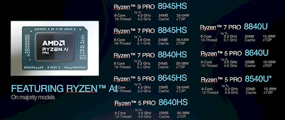
Unleash the Power of AI: AMD Ryzen 8000 Pro Processors Take Productivity to the Next Level
Get ready to supercharge your professional workflow with the arrival of the all-new AMD Ryzen 8000 Pro processors! Building upon the foun...

-
This is what you like to call "Hacking a forum". I call it "Cracking into a forum" ... Learn what hacking mea...
-
Message reactions are popular in social apps such as Instagram, Skype, Discord and more, but it is not a part of WhatsApp till now. Wh...

No comments:
Post a Comment